The Challenge of Visualising Uncertainty
Mapping uncertainty is difficult, but it’s essential for making maps that show the true nature of data
One of the biggest challenges we faced when designing the visual language for farm soil mapping was finding a way to represent uncertainty in maps. It’s a fundamental fact of life that all measurements and predictions are uncertain. So, if you want to make informed decisions based on data, it’s important that you know how certain you can be about that data. This is especially true of farm soil maps because they represent complex 3D data models based on a combination of soil test results, aerial surveys and satellite images.
Maps and charts rarely reveal how certain or uncertain they are. This is because uncertainty isn’t a decisive factor in most of the maps we use. Moreover, adding a visual representation of uncertainty makes a map more challenging to design and more difficult to read. But if uncertainty isn’t represented when it affects decision making, viewers are likely to put either too much trust in a visualisation or not enough. To design reliable soil maps that farmers and agronomists can trust, a clear representation of uncertainty is essential.
What is uncertainty?
In scientific terms, uncertainty describes the range of possible values within which the true value of a measurement lies. When this range of possible values is narrow, the uncertainty is low; when the range is wide, the uncertainty is high. Uncertainty is essentially a measure of how well something is known.
Consider two points within a soil map that both have a modelled pH value of 7. Due to a difference in uncertainty, one point actually represents a range of possible values from 6 to 8 (±1.0), while the other represents a range of possible values between only 6.99 and 7.01 (±0.01).
Both have a pH value of 7.0, but the first value is far less certain than the second. Without knowing this difference in uncertainty, a viewer can only assume that these two values are the same.
Visualising uncertainty in farm soil maps
There isn’t a single ‘best’ way to visualise uncertainty. That’s because there are different kinds of uncertainty and there are different reasons for wanting to understand it.
We worked closely with agronomists to design methods of showing uncertainty that complement the way they solve problems. They told us that, in most cases, they simply want to know, ‘Should I be worried about the data I’m looking at?’ For them, overly detailed information about uncertainty adds needless complexity to maps, and distracts from more important information.
With this in mind, we designed two different ways of visualising uncertainty. This way, map makers and viewers can choose the method that best suits their needs.
Method 1: Threshold Warnings
In most cases, agronomists want to know if uncertainty is above their threshold of concern. In other words, they want to be aware when uncertainty is great enough that it will impact the land management decision they are making. In these cases, so long as the modelled data is certain enough for their purposes, they don’t need to know anything more about its uncertainty.
This threshold will vary for each agronomist and each land management decision. In some cases they will be concerned by a slight amount of uncertainty, in others they will accept a high degree of uncertainty.
We designed a system for interactive maps that allows the viewer to set their tolerance for uncertainty using a slider:
Warning symbols appear over areas of the map where uncertainty is greater than the chosen tolerance. This means that when the tolerance is low, more warning symbols will be shown. And when the tolerance is high, fewer symbols will be shown.
The warning symbols are spaced far enough apart to not obscure the map but close enough together to be clear and useful.
When users want to explore uncertainty, more detail is provided in interactive tooltips:
Method 2: Pixelation
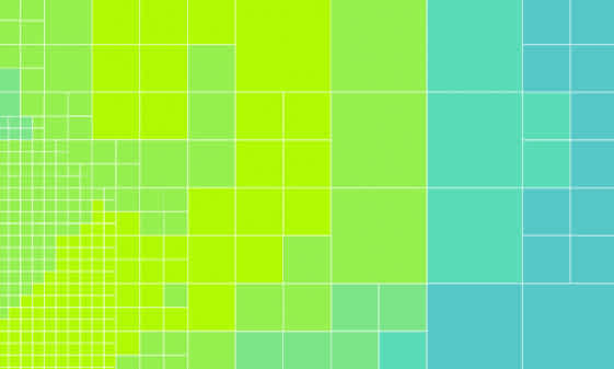
This method divides the farm into pixels that represent an area of similar uncertainty. Smaller pixels show areas where the map is more certain, larger pixels show areas of greater uncertainty. The smallest pixel size is equal to the maximum resolution of the data.
This method is a little more complex than the warning symbols method, but it provides a rich understanding of the data. In a sense, this can be seen as a more ‘true’ representation, because the map becomes less certain where the data model is less certain.
The two methods can be combined, so that warning symbols appears over the pixelated map:
It’s even possible to ‘grey out’ pixels where uncertainty exceeds the user-defined threshold. Removing the colour from these areas is useful when viewers want to ignore data that is beyond their uncertainty threshold.
The value of visualising uncertainty
Revealing uncertainty might seem like admitting to a lack of clarity or quality. But uncertainty is a fact of life and it is often essential for making informed predictions and decisions. As Robert Burns said, there is no such uncertainty as a sure thing.
A visual representation of uncertainty helps agronomists and farmers understand the limits of their data models, and agronomists can use this information to identify areas where they may want to do more soil sampling. Although they add complexity to maps, representations of uncertainty are powerful and important tools.